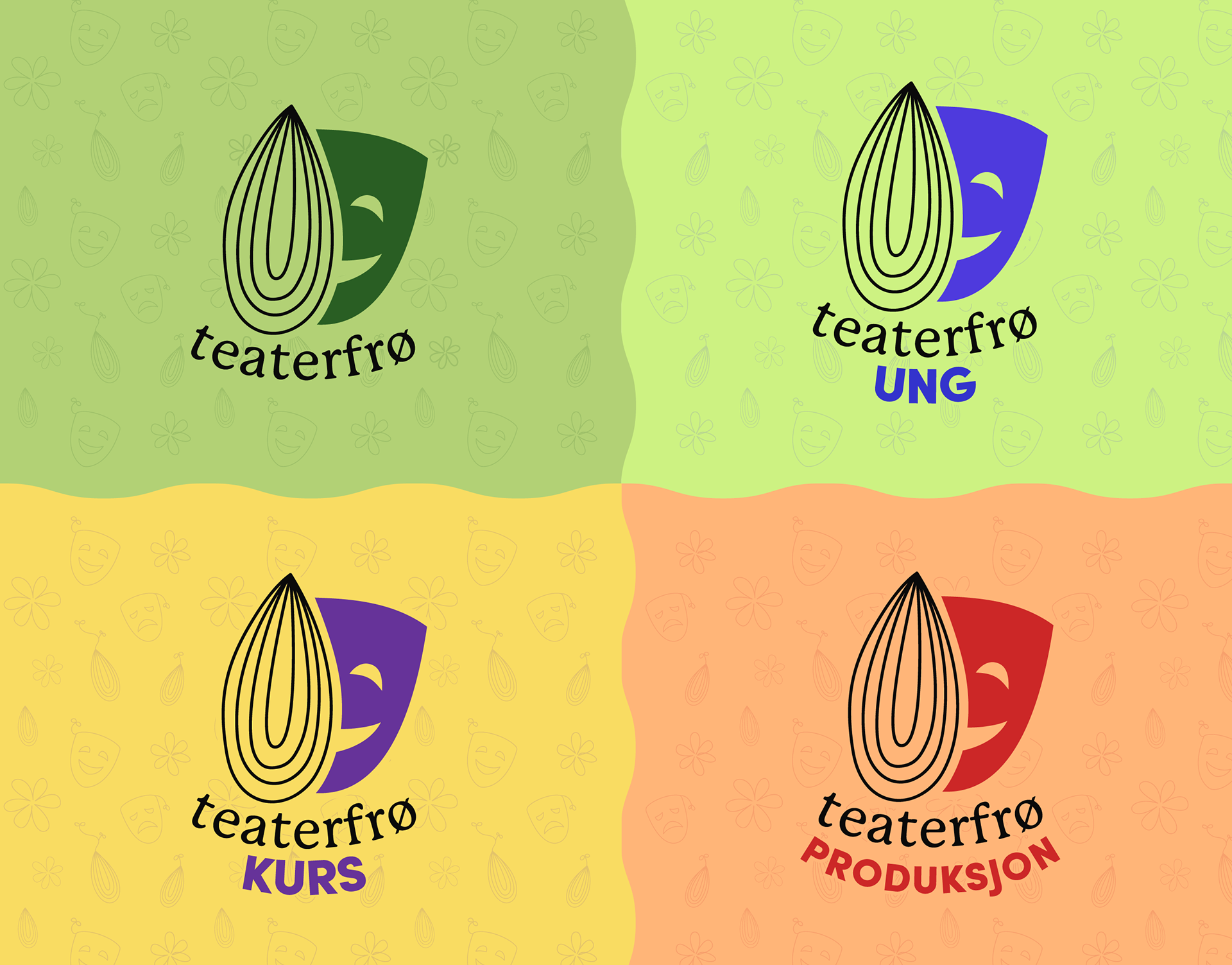
I created four logo variations of both primary and secondary logo for the versatile and creative duo Teaterfrø, and it was a blast! "Frø" is the Norwegian word for seed, which I wanted to include in the logomark, making it readable even without the font. The secondary logo is based on the original logo, where the "ø" is a seed, where I used the same font and seed from the primary logo for consistency.
The challenges was to find colours for each variation that would work just as well together (all variations) as alone (logo and background). But at the same time, not having to pick only one colour combination is definitely this designers dream, so the challenge was definitely a fun one!
When the logo was done and thumbed-up, I started playing around with some illustrations based on the logo to create a simple yet fun pattern as a part of their new identity.